“2 Great Tastes That Taste Great Together” ~ Reece’s
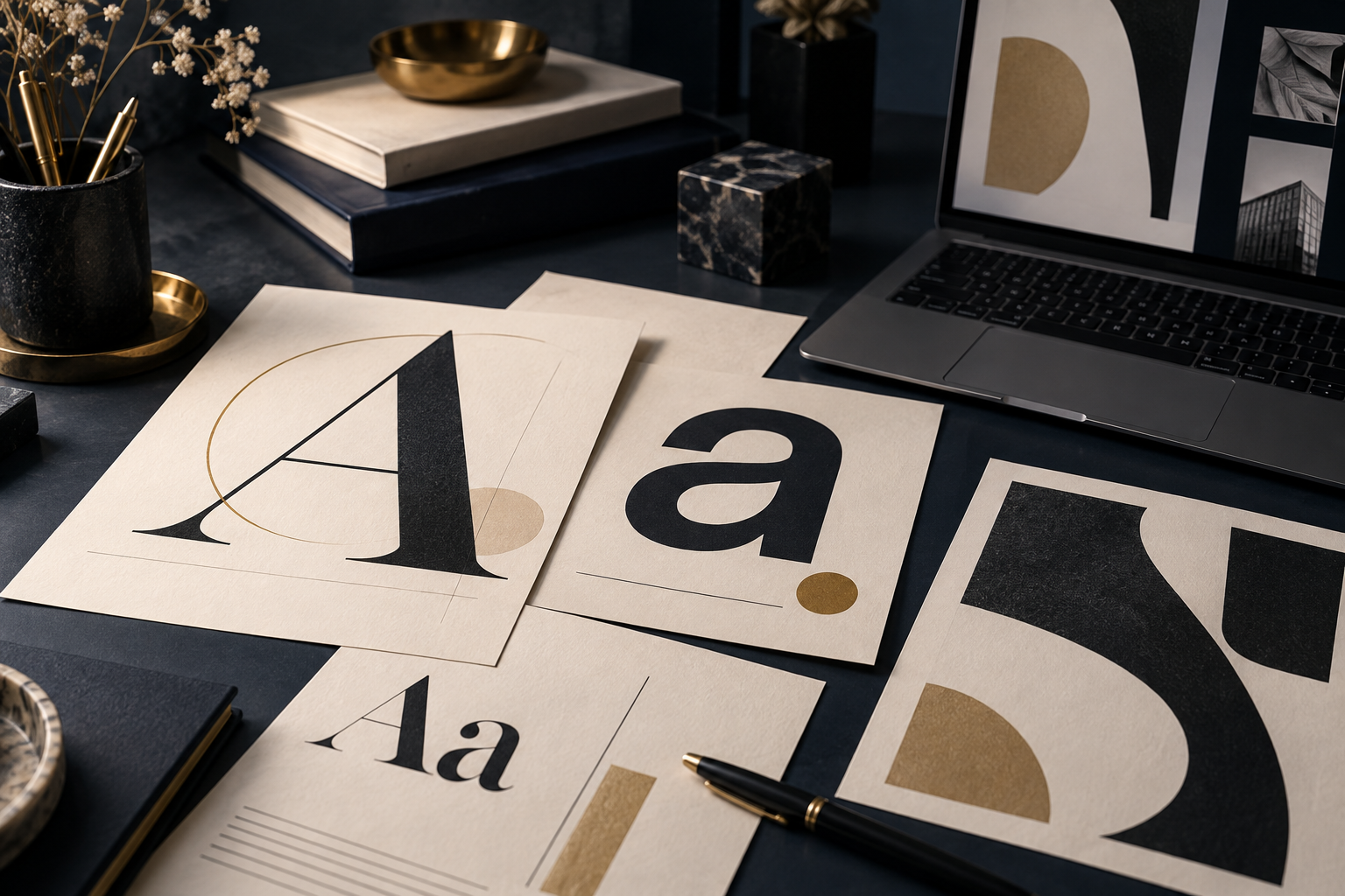
A good web font combination can be a subtle little trick for getting a website to pop. A good pairing of fonts can provide contrast for a website without having to using additional colors or designs.
Meaning you can create a unique look and still stay clean in your design, and provide a great UX (user experience).
Web Font Combination Ideas
- Fira Sans & Merriweather
- Yeseva One & Josefin Sans
- Quicksand (Medium & Light)
- Oxygen & Source Sans Pro
- League Spartan & Libre Baskerville
- Chivo & Overpass
- Georgia and Verdana
- Playball & PT Sans
- Helvetica Bold and Garamond
- Bodoni and Futura
- Asap & Asap
- Franklin Gothic and Baskerville
- Josefin Slab & Maven Pro
- Open Sans Condensed & Lora
- Caslon Bold and Universe Light
- Frutiger Bold and Minion
- Abril Fatface & Roboto
- Minion Bold and Myriad
- Julius Sans One & Archivo Narrow
- Gill Sans Bold and Garamond
- Oswald & Noto Serif
- Clarendon and Trade Gothic
- Open Sans Extra Bold & Cooper Hewitt
- Avenir and Minion
- Dancing Script & EB Garamond
You may notice that a popular formula is to use a Serif font with a sans serif font or 2 or 3 fonts from the same family in different weights and sizes.
Font Definitions
Serif Fonts – Times New Roman is a familiar example of a serif font. They are the fonts with a small line attached to the end of the line of the letter or number. San Serif Fonts – The best example of the san serif (or without a serif) font is Arial. They are the fonts that do not have a small line attached to the end of the line of the letter or number. Script Fonts – When you think of script font you may think Bradley Hand. They are the fonts that link together letter by letter. Slab Serif Fonts – You might think of the font Rockwell when thinking about Slab Serif. They have thick, block like serifs.
Google Web Fonts
It wasn’t long ago that web designers were limited in what fonts could be used natively on a website. You could use any font you wanted as long as it was in an image. The only problem was when designing sites that were content rich, you would still need to use web fonts and they wouldn’t match your images.
You can browse open-source font families on Google Fonts.
A Practical Font-Pairing Framework
Make contrast work for the reader
Use size and weight to make the main idea easy to find.
Choose readable letterforms, comfortable spacing and a useful text size.
Try contrasting families or different weights within one family.
Read a real page at desktop and phone sizes before committing.
10 Great Web font combinations by Stepto & Son Design — external graphic (currently unavailable)
10 Great Web Font Combinations from Stepto & Son Design
These are pairing ideas, not a claim that every listed family is free or available from Google Fonts. Check the specific font’s license and supported styles before using it. Google Fonts documentation explains its open-source catalog.