

Contents
April 21st, Today, Is The Launch Day Of Google’s New Mobile Search Algorithm
“Q: What is this algorithmic update, who will it impact?
A: This update will impact only mobile searchers and it will give a ranking boost to mobile-friendly pages in Google’s mobile search results only.”
(source: search engine land)
At first glance this may not seem like a big deal. Loosing some traffic from mobile searches only. According to findings in the 2014 Mobile Path-to-Purchase study by Telmetrics and xAd, it is a big deal!

This report states that 50% of people who search Google do it on their mobile device. Simply stated that means that if you do not take this update seriously you are in danger of loosing half of your search traffic.
In addition to that it will probably be a pretty big ranking factor for all Google search that you will not be meeting the guidelines to.
And let’s not forget that it is just good business to have your website mobile friendly for your user experience (UX).
How Do You Know If Your Site Is Mobile Friendly
1. The first thing you should check is to see if you have a “Mobile Friendly” tag on your mobile search results.
If you see the light grey tag that says; “Mobile-friendly” next to your website result… you are Good!
2. It is possible that your site may not be indexed yet so if you don’t see it go the Google Mobile-friendly Tester and analyze your site.
If you see the green Awesome! This site is Mobile-Friendly… you are Good!
If you see the red Not Mobile-friendly… you are Not good!
What To Do If You Are Not Mobile Friendly
Funny Story; as I was going to take a screenshot of my site to show you what the tag looks like… I noticed that I did not have the tag! What?
>> If Your Site is “Responsive Design” or “Mobile-friendly”
I knew my website was “Responsive Design” so I just needed to find out what was blocking Google from seeing that.
First I pulled out my phone and did a Google Search for Jason Fox Marketing:

You can see that my Linkedin and About.me pages have the light grey “Mobile-friendly” tag, and my personal site does not.
I had the Mobile Friendly Tag the last 2 times I checked, what happened?
This is where I started to freak out!
I pulled it together and got to work to find out why, it was a simple fix.
I used the Google Mobile Friendly Testing Tool to see how Google saw the mobile version of my site.
I failed the test and was shown a screenshot of how Google saw my mobile site. It was all HTML, Text and links only. That means that the Google Robot were not able to see my CSS code, and perhaps the JS, although that is less important.
I went over to my Google Webmaster Tools and ran a “Fetch as Google” test, using the “Fetch and Render” button. Once they had fetched my site, I clicked on the results to see how it rendered (or how it looked to the Google Robots) and it was the same, HTML only.
Below the Rendering it showed me what files were blocked, and gave me a “Robots.txt Tester”. I tested my Robots.txt file, and remembered that I had disallowed Google access to some of my folders.
This is what the Robots.txt tester looks like:
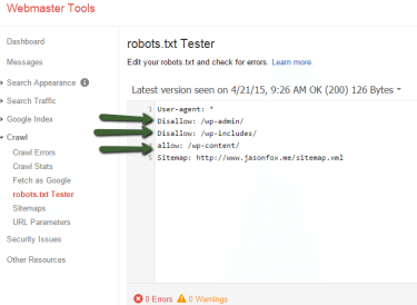
You can see that I have a couple of folders blocked from Google (Disallow:), but I also had the wp-content folder blocked and this is where my CSS files were located. I just needed to (Allow:) access to my wp-content folders.
I use the WordPress SEO plugin by Yoast and can access my Robots.txt file by simply clicking:
SEO >> Tools >> File Editor >> Make my adjustment >> Save changes to Robots.txt

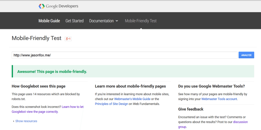
I cleared all my caches and went back to the Google Mobile Friendly Tester and re tested my websites and was given the Green Awesome!
Yay. All that took me about 10 minutes. The best 10 minutes I will spend today.
>>If Your Website is not “Responsive-Design” or “Mobile-Friendly”
If your website is out of date and was not built “Responsive Design” or have a “Mobile-Friendly” version of the site then you have some work to do.
I would suggest you contact your Webmaster and find out what it will take to get your site up to date.
If you are the Webmaster then you are going to need to Re Design your site or add a Mobile version. This can be fairly simple if you are using WordPress.
If you are using WordPress and your site was not designed to be Responsive you can use a plugin to make your site “Mobile-Friendly”.
I would suggest using the “Jetpack” plugin and activating their “Mobile Theme” setting.
I have also had good luck with “WP Touch” in the past.
Summary
Today, April 21st 2015, is the day that Google begins to roll out their “Mobile-Friendly” Search Algorithm. This update will effectively remove your site from mobile Google searches and decrease your general SEO if you are non compliant.
You can see if you are compliant by searching for your site on your mobile Google search and locating a grey “Mobile-friendly” tag next to your site, or visit the Google Mobile Friendly Test and analyzing your site.
If you are not currently compliant you may need to think of doing a website redesign or adding a mobile friendly plugin if you are using WordPress.

Written by : jasonfox
Jason Fox - Real Estate Marketing
Business: We build WordPress Real Estate Websites with IDX
Me: #GoHawks, #BringBackTheSonics, #MaybeNextYearMariners, #ILoveMyKids #SeattleSunLover #SeattleWaterLover #BFF
Blog: Focuses on Wordpress Websites, Content Management, SEO Services, SEM Campaigns, Social Media Marketing, Email Marketing, Beautiful Design, IDX, and more.
Jason, thanks for the wonderfully detailed post and potentially overlooked points!
Thank you Broker List! Hope it helped.