How Data Visualization Boosts Real Estate Marketing Success

If you want to grow your real estate business, adding data visualization boosts customer experience (CX). When house buyers see cold facts laid out on a sheet of paper, it can feel overwhelming. Putting complex data such as interest rates and rising house prices on a visual chart allows them to understand the rules of real estate investment and why they should buy today rather than delaying.

Between showing properties and the paperwork for offers, finding time for marketing is tough. Fortunately, data visualization is fairly painless with today’s artificial intelligence (AI) tools that can generate a data-based graph in seconds.

According to Forbes, ‘Infographics, charts, data visualizations, and 3D models are now just as critical as long-form articles and posts, with 57% of marketers relying on these visual tools to drive engagement and understanding in their content marketing strategies.’

Real estate agent typing on laptop

Benefits of Using Data Visualization in Real Estate

In June 2024, the National Association of Realtors reported that the average price for houses hit a record high. The result was a drop of 5.4% in home sales. The shift from a seller’s market to a buyer’s market has many real estate professionals looking for ways to entice clients to buy now rather than later.

Data visualizations can convince even the most reluctant consumers with cold, hard facts. Here are some of the benefits of using visuals:

  • Gain a competitive advantage with virtual video tours.
  • Improve engagement with high quality photos.
  • Ensure home buyers fully understand the pros and cons of a property.

Showing visual data to leads can benefit real estate agents’ revenue, lead to more sales and help close deals.
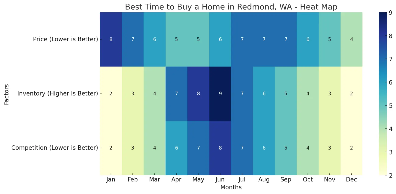
heat map illustrating the best times to buy a home in Redmond, WA

Heat map generated with ChatGPT AI using data found in the market report shown below. The image illustrates the best times to buy a home in Redmond, WA, based on factors such as price, inventory, and competition. The colors indicate how favorable each month is for each factor.

How to Use Visuals to Boost Your Success

If visuals are the thing missing from your real estate marketing efforts, you’ll find many ways to implement them in the strategies you already use to attract new clients. Visual data is an essential way to show potential buyers the pros and cons of different properties they’re considering buying. AI can generate a graph of the must-haves on their list and compare those with the details of the houses they’ve viewed.

Showcase the value of the choice you think most closely matches the client’s lifestyle and future needs. For example, if you’re trying to help a young couple just starting their family find a location, you might know the extra bedroom will be useful as their numbers grow or even just as their child becomes a teenager. On the other hand, a home buyer who is single may want a property close to restaurants and local nightlife and care less about square footage and a big backyard.
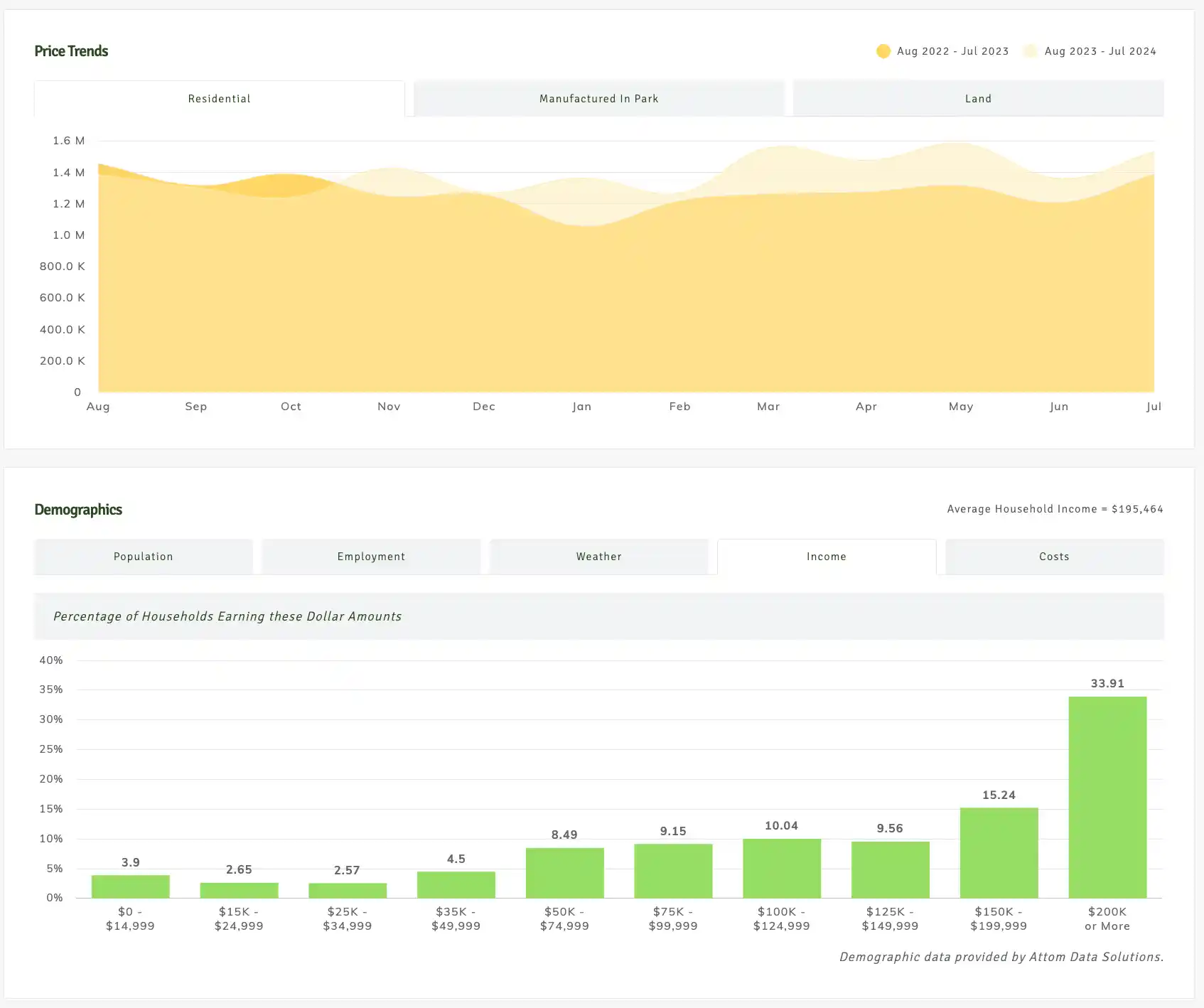
Chart showing residential home price trends over the past two years and demographics for the city of Redmond, WA.

* Market report showing overview of residential price trends over the past two years and demographics for the city of Redmond, WA.

Which Visual Data Should Agents Highlight?

The types of real estate data you can turn into visualizations include but aren’t limited to:

  • Location: Highlight the neighborhood, schools and nearby amenities.
  • Property characteristics: Include the number of bedrooms and bathrooms, space, yard, attached or detached garages, and special features.
  • Price and sales comparisons: Show the listing price and selling price of similar homes in the neighborhood, number of days on market, and special offers such as a flooring allowance.
  • Demographics: What is the median household income in the neighborhood and how do you compare? What is the population density for the area?
  • Real estate market trends: Buyers must know the average sales price for homes in the city, how many homes meet their needs are available and interest rate trends.
  • Mortgage comparisons: Shoppers on a tight budget may be able to buy a home for a mere 3% down payment with certain types of loans. Offer a chart showing the costs and pros and cons of each type.

Charts are a starting point to educate home buyers and initiate in-depth discussions about topics such as debt to income ratio, savings, true costs of home ownership and fixing your credit score.
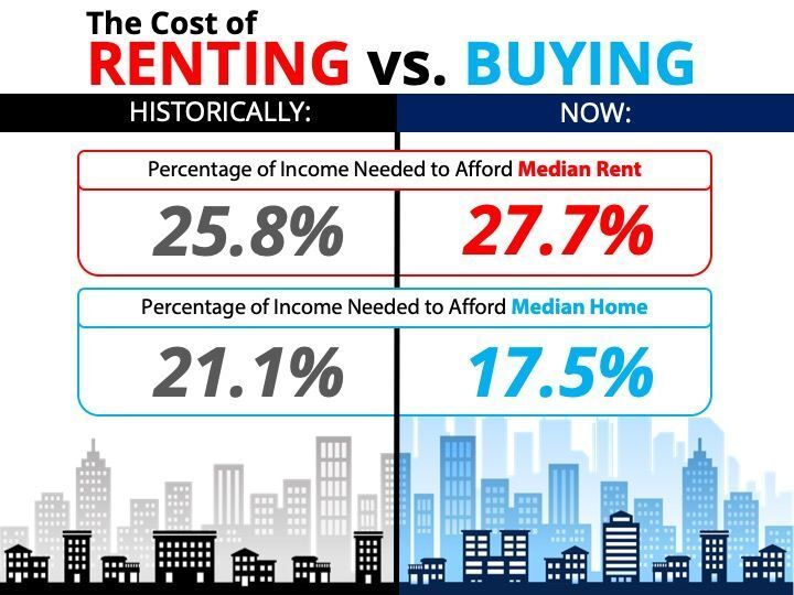
THE COST OF RENTING VS BUYING

Infographic illustrating the cost of renting vs buying a new home.

Possible Visual Data Formats

You’ll need different types of visuals for various uses. When it comes to visual data, tap into the power of simplifying hard facts, have a little fun or share details. Here are some of the types of visual data formats you might use and why.

Infographics

The visual appeal of infographics allows you to present multiple facts around a single topic to entice people to think or see things from a different angle. A real estate professional might choose to create an infographic on why now is the best time to buy a home. They could include historical data, info on rising costs of buying a home and some numbers on how much equity the buyer will gain in a few years.

You can also use a timeline within an infographic to explain the steps in the home buying process. Share information to help the buyer prepare for the details they’ll need to gather during mortgage approval. You can also pull small snippets from a longer infographic and share micrographic details as necessary

Infographics are 30 times more likely to be read than a written article – Demandsage 2023

Graphs

Graphs are an excellent way to showcase comparative topics. For example, an agent could create a graph showing the rising costs of home ownership over several years. Graphs can help create a sense of urgency to encourage the buyer to make an offer today through data visualization on how long similar homes were on the market.

You can also use graphs for your own tracking data. Spot problems in your sales process and fix them.

Pie Charts

Customize your marketing efforts by creating a pie chart of your average client. Include data such as the average age, income, gender and lifestyles. Once you better understand your typical user, you can tailor your message to better meet their needs.

Include psychographic as well as demographic information for a full picture of user personas. The more you know your typical client, the better you can personalize your marketing messages to engage them and develop new leads.

Track percentages such as positive versus negative reviews. Find out if your past clients trust you enough to tell their friends and family about you. About 60% of consumers recommend companies they trust.

Heat Map

One useful way to show population density to potential clients is through a heat map. If someone wants to live in a thriving metropolitan area, they’ll want to see plenty of others to interact with. A client who seeks quiet, country living will want a low-density heat map.

You can also use the maps to figure out your best marketing methods in various areas. If your listings fall in a particular school district, you may want to include an ad at the local theater, in the high school newspaper or on menus at various area restaurants families frequent.

Venn Diagram

Help buyers analyze the most important aspects of their property searches. For example, how do prize, property size and budget correlate? You can narrow your search and ensure you’re meeting your buyers’ needs.

You can also use Venns to expand your networking efforts and reach new clients. Each circle shows groups of people you’re connected to and how they might expand and connect you to new groups and audiences.

Programs to Create the Visual Data

One way to save time is to grab some pre-made, royalty-free real estate infographics and share them via your website, newsletter and social media. You could take some graphic design courses, but it may be easier to either hire someone from a job gig site such as UpWork or Fiverr, or purchase templates already made.

If you want some simple software you can use without coding knowledge, try:

  • Canva: Comes with graphics, photos and templates
  • Excel: Put in the data and go to Insert/Charts and choose the type of data visualization you desire, such as a bar chart
  • GraphmakerAI: Make a chart with prompts and computer help
  • Tableau: Drag and drop tool but you will need to study the right way to format calculations

There are many different tools available. It’s crucial to find one you feel comfortable using and that provides the visualizations you need to market to your clients.

Man at desk looking at his computer reviewing real estate market data

Where to Use Visual Data

Once you’ve created some valuable visualizations, the next trick to improving your marketing efforts is to know where and how to use the material.

Social Media & Your Website

If you have a website or an agent page as part of a larger agency, you should include general details to generate interest and discussions. You can use charts to educate potential clients and make sure they are ready to buy before they contact you. Include an infographic with percentages or ranges in areas such as salary, savings and credit score.

Some of the places you can add an infographic and engage with users include sites like Facebook and Instagram. You can also create a video with different graphics and commentary and upload to YouTube, TikTok and Facebook Reels.

Newsletters

If you don’t yet have a newsletter, it is one of the top ways to stay in touch with your customers. Those who’ve previously bought or sold a home through you may move again in a few years, becoming clients a second time. If they receive a weekly or monthly email from you with tips and advice, they’re likely to remember your name when they’re ready to dip their toes back into the real estate pool or to share your information with others in the market for a house.

Infographics add interest and detail to articles you post in your newsletter. You can pull out micro sections from a larger infographic to prove a point and back it up with relevant images.

Printed Materials

Probably the most powerful way to use visuals is by creating personalized charts for individual clients and sharing them during your one-on-ones. You

Gain an Edge

Anything you can do to stand out from other agents in your area will drive your marketing success. You can only sell more homes if you attract more clients, so strive to get your name out there and become an authority in your niche. The more data you can provide, the clearer it is that you do your homework and know the markets.

Frequently Asked Questions About Data Visualization

What is data visualization in real estate marketing?

Data visualization is taking complex real estate data—market trends, property values, buyer demographics— and turning it into charts, graphs and infographics so clients can make decisions fast.

How can data visualization help me sell homes faster?

Visual data cuts through the clutter, presents the important information in a clear and compelling way. Whether it’s market trends or property comparisons, these visuals create urgency and help buyers see the value in making an offer now rather than later.

Do I need to be tech savvy to create visual data for my listings?

Nope! There are plenty of user friendly tools like Canva or GraphmakerAI where you can create amazing visuals without any tech background. Plus many platforms have templates so you can just plug in your data and go.

What types of visuals are most effective in real estate marketing?

The most effective visuals are the ones that answer your client’s questions. For example, heat maps are great for showing population density, pie charts for breaking down a property’s features. The key is to match the visual to the message you want to convey.

Is visual storytelling the same as data visualization?

Not exactly. Data visualization is about presenting information through visuals like charts and graphs. Visual storytelling goes a step further, using those visuals to create a narrative that engages and resonates with your audience on an emotional level.

Can data visualization be used in both digital and print marketing?

Yes! While digital platforms like your website or social media are perfect for sharing dynamic visuals, print materials can benefit too. Imagine handing a client a personalized chart during a meeting—it’s a powerful way to communicate value face to face.

How often should I update my visual data?

Real estate markets change fast, so it’s good to update your visuals regularly—at least once a quarter or whenever there’s a big market shift. Keeping your data current means you’re always providing the most up to date information to your clients.

Is data visualization only for tech savvy buyers?

Nope. Data visualization actually levels the playing field by making complex information accessible to everyone, regardless of their tech skills. It’s all about presenting information in a way that’s easy to understand, no matter who’s looking at it.

Find it Fast

WANT A WEBSITE?

Schedule a one-on-one no obligation consultation to find out if a Jason Fox Real Estate WordPress Website is right for you.

BECOME A MEMBER

Become A Free DIY Real Estate Marketing Member & Get Access To:

LARGEST COLLECTION OF

Real Estate Marketing e-Books, Guides, Templates, & whitepapers

ON THE INTERNET

+ OVER 70 How To Website Training Videos including; WordPress, Agent Evolution Themes, & IDX Broker

+ DIY Real Estate Marketing Tips and Strategies Delivered to Your Inbox

post contents

If you want to grow your real estate business, adding data visualization boosts customer experience (CX). When house buyers see cold facts laid out on a sheet of paper, it can feel overwhelming. Putting complex data such as interest rates and rising house prices on a visual chart allows them to understand the rules of real estate investment and why they should buy today rather than delaying.

Between showing properties and the paperwork for offers, finding time for marketing is tough. Fortunately, data visualization is fairly painless with today’s artificial intelligence (AI) tools that can generate a data-based graph in seconds.

According to Forbes, ‘Infographics, charts, data visualizations, and 3D models are now just as critical as long-form articles and posts, with 57% of marketers relying on these visual tools to drive engagement and understanding in their content marketing strategies.’

Real estate agent typing on laptop

Benefits of Using Data Visualization in Real Estate

In June 2024, the National Association of Realtors reported that the average price for houses hit a record high. The result was a drop of 5.4% in home sales. The shift from a seller’s market to a buyer’s market has many real estate professionals looking for ways to entice clients to buy now rather than later.

Data visualizations can convince even the most reluctant consumers with cold, hard facts. Here are some of the benefits of using visuals:

  • Gain a competitive advantage with virtual video tours.
  • Improve engagement with high quality photos.
  • Ensure home buyers fully understand the pros and cons of a property.

Showing visual data to leads can benefit real estate agents’ revenue, lead to more sales and help close deals.

heat map illustrating the best times to buy a home in Redmond, WA

Heat map generated with ChatGPT AI using data found in the market report shown below. The image illustrates the best times to buy a home in Redmond, WA, based on factors such as price, inventory, and competition. The colors indicate how favorable each month is for each factor.

How to Use Visuals to Boost Your Success

If visuals are the thing missing from your real estate marketing efforts, you’ll find many ways to implement them in the strategies you already use to attract new clients. Visual data is an essential way to show potential buyers the pros and cons of different properties they’re considering buying. AI can generate a graph of the must-haves on their list and compare those with the details of the houses they’ve viewed.

Showcase the value of the choice you think most closely matches the client’s lifestyle and future needs. For example, if you’re trying to help a young couple just starting their family find a location, you might know the extra bedroom will be useful as their numbers grow or even just as their child becomes a teenager. On the other hand, a home buyer who is single may want a property close to restaurants and local nightlife and care less about square footage and a big backyard.

Chart showing residential home price trends over the past two years and demographics for the city of Redmond, WA.

* Market report showing overview of residential price trends over the past two years and demographics for the city of Redmond, WA.

Which Visual Data Should Agents Highlight?

The types of real estate data you can turn into visualizations include but aren’t limited to:

  • Location: Highlight the neighborhood, schools and nearby amenities.
  • Property characteristics: Include the number of bedrooms and bathrooms, space, yard, attached or detached garages, and special features.
  • Price and sales comparisons: Show the listing price and selling price of similar homes in the neighborhood, number of days on market, and special offers such as a flooring allowance.
  • Demographics: What is the median household income in the neighborhood and how do you compare? What is the population density for the area?
  • Real estate market trends: Buyers must know the average sales price for homes in the city, how many homes meet their needs are available and interest rate trends.
  • Mortgage comparisons: Shoppers on a tight budget may be able to buy a home for a mere 3% down payment with certain types of loans. Offer a chart showing the costs and pros and cons of each type.

Charts are a starting point to educate home buyers and initiate in-depth discussions about topics such as debt to income ratio, savings, true costs of home ownership and fixing your credit score.

THE COST OF RENTING VS BUYING

Infographic illustrating the cost of renting vs buying a new home.

Possible Visual Data Formats

You’ll need different types of visuals for various uses. When it comes to visual data, tap into the power of simplifying hard facts, have a little fun or share details. Here are some of the types of visual data formats you might use and why.

Infographics

The visual appeal of infographics allows you to present multiple facts around a single topic to entice people to think or see things from a different angle. A real estate professional might choose to create an infographic on why now is the best time to buy a home. They could include historical data, info on rising costs of buying a home and some numbers on how much equity the buyer will gain in a few years.

You can also use a timeline within an infographic to explain the steps in the home buying process. Share information to help the buyer prepare for the details they’ll need to gather during mortgage approval. You can also pull small snippets from a longer infographic and share micrographic details as necessary

Infographics are 30 times more likely to be read than a written article – Demandsage 2023

Graphs

Graphs are an excellent way to showcase comparative topics. For example, an agent could create a graph showing the rising costs of home ownership over several years. Graphs can help create a sense of urgency to encourage the buyer to make an offer today through data visualization on how long similar homes were on the market.

You can also use graphs for your own tracking data. Spot problems in your sales process and fix them.

Pie Charts

Customize your marketing efforts by creating a pie chart of your average client. Include data such as the average age, income, gender and lifestyles. Once you better understand your typical user, you can tailor your message to better meet their needs.

Include psychographic as well as demographic information for a full picture of user personas. The more you know your typical client, the better you can personalize your marketing messages to engage them and develop new leads.

Track percentages such as positive versus negative reviews. Find out if your past clients trust you enough to tell their friends and family about you. About 60% of consumers recommend companies they trust.

Heat Map

One useful way to show population density to potential clients is through a heat map. If someone wants to live in a thriving metropolitan area, they’ll want to see plenty of others to interact with. A client who seeks quiet, country living will want a low-density heat map.

You can also use the maps to figure out your best marketing methods in various areas. If your listings fall in a particular school district, you may want to include an ad at the local theater, in the high school newspaper or on menus at various area restaurants families frequent.

Venn Diagram

Help buyers analyze the most important aspects of their property searches. For example, how do prize, property size and budget correlate? You can narrow your search and ensure you’re meeting your buyers’ needs.

You can also use Venns to expand your networking efforts and reach new clients. Each circle shows groups of people you’re connected to and how they might expand and connect you to new groups and audiences.

Programs to Create the Visual Data

One way to save time is to grab some pre-made, royalty-free real estate infographics and share them via your website, newsletter and social media. You could take some graphic design courses, but it may be easier to either hire someone from a job gig site such as UpWork or Fiverr, or purchase templates already made.

If you want some simple software you can use without coding knowledge, try:

  • Canva: Comes with graphics, photos and templates
  • Excel: Put in the data and go to Insert/Charts and choose the type of data visualization you desire, such as a bar chart
  • GraphmakerAI: Make a chart with prompts and computer help
  • Tableau: Drag and drop tool but you will need to study the right way to format calculations

There are many different tools available. It’s crucial to find one you feel comfortable using and that provides the visualizations you need to market to your clients.

Man at desk looking at his computer reviewing real estate market data

Where to Use Visual Data

Once you’ve created some valuable visualizations, the next trick to improving your marketing efforts is to know where and how to use the material.

Social Media & Your Website

If you have a website or an agent page as part of a larger agency, you should include general details to generate interest and discussions. You can use charts to educate potential clients and make sure they are ready to buy before they contact you. Include an infographic with percentages or ranges in areas such as salary, savings and credit score.

Some of the places you can add an infographic and engage with users include sites like Facebook and Instagram. You can also create a video with different graphics and commentary and upload to YouTube, TikTok and Facebook Reels.

Newsletters

If you don’t yet have a newsletter, it is one of the top ways to stay in touch with your customers. Those who’ve previously bought or sold a home through you may move again in a few years, becoming clients a second time. If they receive a weekly or monthly email from you with tips and advice, they’re likely to remember your name when they’re ready to dip their toes back into the real estate pool or to share your information with others in the market for a house.

Infographics add interest and detail to articles you post in your newsletter. You can pull out micro sections from a larger infographic to prove a point and back it up with relevant images.

Printed Materials

Probably the most powerful way to use visuals is by creating personalized charts for individual clients and sharing them during your one-on-ones. You

Gain an Edge

Anything you can do to stand out from other agents in your area will drive your marketing success. You can only sell more homes if you attract more clients, so strive to get your name out there and become an authority in your niche. The more data you can provide, the clearer it is that you do your homework and know the markets.

Frequently Asked Questions About Data Visualization

What is data visualization in real estate marketing?

Data visualization is taking complex real estate data—market trends, property values, buyer demographics— and turning it into charts, graphs and infographics so clients can make decisions fast.

How can data visualization help me sell homes faster?

Visual data cuts through the clutter, presents the important information in a clear and compelling way. Whether it’s market trends or property comparisons, these visuals create urgency and help buyers see the value in making an offer now rather than later.

Do I need to be tech savvy to create visual data for my listings?

Nope! There are plenty of user friendly tools like Canva or GraphmakerAI where you can create amazing visuals without any tech background. Plus many platforms have templates so you can just plug in your data and go.

What types of visuals are most effective in real estate marketing?

The most effective visuals are the ones that answer your client’s questions. For example, heat maps are great for showing population density, pie charts for breaking down a property’s features. The key is to match the visual to the message you want to convey.

Is visual storytelling the same as data visualization?

Not exactly. Data visualization is about presenting information through visuals like charts and graphs. Visual storytelling goes a step further, using those visuals to create a narrative that engages and resonates with your audience on an emotional level.

Can data visualization be used in both digital and print marketing?

Yes! While digital platforms like your website or social media are perfect for sharing dynamic visuals, print materials can benefit too. Imagine handing a client a personalized chart during a meeting—it’s a powerful way to communicate value face to face.

How often should I update my visual data?

Real estate markets change fast, so it’s good to update your visuals regularly—at least once a quarter or whenever there’s a big market shift. Keeping your data current means you’re always providing the most up to date information to your clients.

Is data visualization only for tech savvy buyers?

Nope. Data visualization actually levels the playing field by making complex information accessible to everyone, regardless of their tech skills. It’s all about presenting information in a way that’s easy to understand, no matter who’s looking at it.

WANT A WEBSITE?

Schedule a one-on-one no obligation consultation to find out if a Jason Fox Real Estate WordPress Website is right for you.

Latest articles

BECOME A MEMBER

Become A Free DIY Real Estate Marketing Member & Get Access To:

LARGEST COLLECTION OF

Real Estate Marketing e-Books, Guides, Templates, & whitepapers

ON THE INTERNET

+ OVER 70 How To Website Training Videos including; WordPress, Agent Evolution Themes, & IDX Broker

+ DIY Real Estate Marketing Tips and Strategies Delivered to Your Inbox

Share this article

By Published On: August 28th, 2024
Written by : Evelyn Long

Evelyn Long is a writer with over 5 years of experience in the real estate business. She is the co-founder of the home living magazine Renovated, where she writes about market trends.

Leave A Comment